Creating Effective Mobile-Friendly Email Campaigns for Marketing Success
Introduction
Importance of Mobile Optimization in Email Marketing
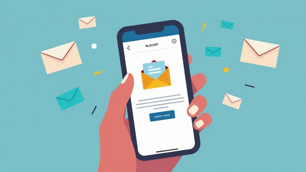
In today’s digital world, more people check their emails on mobile devices than ever before. In fact, studies show that over 50% of all email opens happen on smartphones. This trend highlights the importance of optimizing your email campaigns for mobile users. If your emails aren’t mobile-friendly, you risk losing valuable engagement and potential customers. By ensuring your emails are easy to read and interact with on smaller screens, you can boost open rates, click-through rates, and ultimately drive more sales. Let’s explore how to create effective mobile-friendly email campaigns that will enhance your marketing success.
Understanding Mobile-Friendly Emails
What Makes an Email Mobile-Friendly?
A mobile-friendly email is designed specifically for viewing on smartphones and tablets. Here are some key features that make an email mobile-friendly:
- Responsive Design: This design automatically adjusts the layout based on the screen size.
- Readable Fonts: Use larger font sizes (at least 14px) to ensure readability without zooming.
- Simple Layout: A single-column layout is easier to navigate on small screens.
- Touch-Friendly Buttons: Ensure buttons are large enough for fingers to tap easily.
By incorporating these elements, you can create a seamless experience for users accessing your content via their phones.
Key Statistics on Mobile Email Usage
Understanding the statistics behind mobile email usage can help emphasize its significance:
- Over 50% of all emails are opened on mobile devices.
- 70% of consumers delete emails that don’t display correctly on their phones.
- Emails optimized for mobile have a higher click-through rate by up to 15%.
These numbers demonstrate why focusing on mobile optimization is essential for any successful email marketing strategy.
Designing for Mobile Devices
Responsive Design vs. Adaptive Design
When designing emails, you may come across two main types of design: responsive and adaptive.
- Responsive Design adjusts fluidly based on the device’s screen size. It uses CSS media queries to change styles according to different devices.
- Adaptive Design, however, creates fixed layouts tailored to specific screen sizes. While it can provide a better experience for certain devices, it may not be as flexible as responsive design.
For most marketers, responsive design is preferred because it ensures consistency across various devices while providing a user-friendly experience.
Best Practices for Layout and Formatting
To ensure your emails look great on any device, follow these best practices:
- Use a Single Column Layout: This format allows easy scrolling and reading without horizontal scrolling.
- Limit Image Sizes: Large images can slow down loading times; keep them optimized.
- Keep Text Short and Sweet: Aim for concise messages that get straight to the point.
- Include Plenty of White Space: This helps separate sections and makes content easier to digest.
By adhering to these guidelines, you’ll create visually appealing emails that engage readers effectively.
Crafting Compelling Content
Writing Concise Subject Lines and Preheaders
The subject line is often what determines whether someone opens your email or not—especially on mobile devices where space is limited! Keep subject lines short (around 30 characters) while still conveying value or urgency.
Preheaders also play an important role; they provide additional context about the content inside the email right after the subject line appears in inboxes. Make sure both elements work together harmoniously!
The Importance of Clear Call-to-Actions
Your call-to-action (CTA) should be clear and compelling so readers know exactly what action you want them to take next—whether it’s clicking through to a website or making a purchase! Use contrasting colors so CTAs stand out against other content within the email body.
Ensure CTAs are large enough (at least 44×44 pixels) so they’re easy for users’ fingers when tapping from their phones!
Testing and Analyzing Your Campaigns
Tools for Testing Mobile Compatibility
Before sending out your campaign, testing its appearance across various devices is crucial! Several tools can help with this process:
- Litmus: Allows you to preview how your emails will look in different clients/devices before sending them out.
- Email On Acid: Similar functionality but includes additional analytics features post-send!
- Mailtrap: Great tool if you’re looking at testing HTML/CSS code specifically without spamming actual inboxes during development stages!
Using these tools will help identify any issues early-on so adjustments can be made accordingly!
Metrics to Measure Success in Mobile Campaigns
To gauge how well your campaigns perform among mobile users consider tracking metrics such as:
- Open Rates
- Click-through Rates
- Conversion Rates
- Bounce Rates
Analyzing this data helps refine future strategies ensuring continued improvement over time!
Common Mistakes to Avoid
Pitfalls in Mobile Email Design
Even seasoned marketers sometimes fall into traps when designing their campaigns! Here are common mistakes worth avoiding:
- Ignoring Load Times – Heavy images or complex designs slow down loading speeds leading frustrated recipients who might abandon ship!
- Using Small Fonts – Tiny text makes reading difficult resulting in decreased engagement levels overall!
- Failing To Test Across Devices – Not checking compatibility could lead unexpected surprises once sent out into real-world scenarios!
Avoiding these pitfalls keeps user experiences positive encouraging further interactions down-the-line!
How To Ensure Accessibility For All Users
Accessibility matters greatly when creating inclusive experiences! Consider implementing features like alt-text descriptions alongside images allowing visually impaired individuals access visual information contained within each message sent out too!
Also use proper heading structures throughout copy enabling screen readers navigate seamlessly through content provided enhancing overall usability standards achieved during creation phases too!
Case Studies: Successful Mobile-Friendly Email Campaigns
Examples from Leading Brands
Many brands excel at crafting effective mobile-friendly campaigns! For instance:
- Starbucks’ loyalty program updates feature eye-catching visuals paired with clear CTAs prompting immediate customer interaction!
- Amazon often sends personalized recommendations directly targeting interests based upon previous browsing behaviors maximizing relevancy improving conversion chances significantly too!
These examples showcase how thoughtful design combined with strategic messaging leads towards greater success rates overall within competitive markets today!
Lessons Learned from Their Successes
From studying successful brands we learn several key lessons including:
- Prioritize User Experience Above All Else – Always think about what would delight customers rather than just pushing products/services onto them blindly!
- Utilize Data Effectively – Leverage insights gained from past performance metrics informing future decisions made regarding creative direction taken moving forward consistently over time too!!
Implementing these lessons into personal strategies increases likelihood achieving desired outcomes long-term successfully navigating ever-changing landscape found within digital realms alike today!!
Conclusion
Recap of Best Practices for Effective Mobile-Friendly Email Campaigns
Creating effective mobile-friendly email campaigns requires attention to detail—from understanding what makes an email truly accessible across various platforms down through careful consideration given towards crafting engaging content tailored specifically towards target audiences themselves ultimately driving results sought after continuously evolving landscapes faced daily by marketers everywhere around globe alike today!! Remember always prioritize responsiveness along with clarity ensuring every touchpoint resonates positively amongst recipients fostering lasting relationships built upon trust established through consistent quality delivered regularly throughout interactions experienced collectively together moving forward onward always striving excellence achieved collaboratively together united purposefully working towards shared goals ahead!!
📢 Explore More: Continue Your Journey!
If this article helped you understand how vital it is to optimize your emails effectively across multiple platforms check out The Ultimate Guide To Crafting Engaging Newsletters! It covers powerful insights into creating newsletters that captivate audiences while enhancing brand loyalty effectively over time effortlessly building connections stronger than ever before possible now!!
👉 Click here to read more!







![NEEWER 55W 18"/45cm Ring Light Kit [New Version], 5600K Dimmable ...](https://m.media-amazon.com/images/I/414QLqvZWLL._AC_.jpg)


