Effective Strategies for Mobile-Friendly Email Campaigns
Introduction
In today’s digital world, mobile-friendly email campaigns are essential. With more people checking their emails on smartphones and tablets, your messages need to look great and be easy to read on smaller screens. If your emails aren’t optimized for mobile devices, you risk losing potential customers and engagement. Understanding how mobile usage affects email engagement can help you create effective campaigns that capture attention and drive action.
Understanding the Mobile Email Landscape
Statistics on Mobile Email Usage
Mobile devices account for over 50% of all email opens globally. According to recent studies, about 70% of users delete emails that don’t display well on their phones. This shows just how critical it is to design emails with mobile users in mind. As smartphone technology continues to advance, these numbers are likely to grow even higher.
Trends in Mobile Email Design
Mobile email design trends are shifting towards simplicity and clarity. Minimalist designs with bold visuals attract attention without overwhelming the reader. Additionally, using single-column layouts ensures that content flows smoothly on small screens. Interactive elements like buttons instead of links also enhance user experience by making navigation easier.
Key Elements of a Mobile-Friendly Email Campaign
Responsive Design Principles
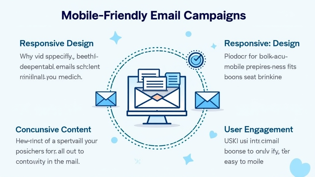
Responsive design is crucial for creating mobile-friendly emails. This means your email should automatically adjust its layout based on the device used to view it. Using flexible grids and images ensures that your content looks good no matter what screen size it’s viewed on.
Optimizing Subject Lines for Mobile Devices
Subject lines play a significant role in whether or not your email gets opened—especially on mobile devices where space is limited. Aim for concise subject lines that grab attention quickly; ideally, keep them under 50 characters so they don’t get cut off.
Importance of Clear and Concise Content
When it comes to content, less is often more—especially in mobile emails! Use short paragraphs and bullet points to make information digestible at a glance. Your goal should be clear communication without overwhelming the reader with too much text.
Best Practices for Creating Mobile-Friendly Emails
Using Legible Fonts and Sizes
Choose fonts that are easy to read on small screens; sans-serif fonts typically work best for digital formats. Ensure font sizes are large enough (at least 14px) so readers don’t have to zoom in or squint while reading your message.
Effective Use of Images and Visuals
Images can enhance your message but must be optimized for fast loading times. Use compressed images that maintain quality without slowing down load speeds. Also, ensure images have alt text so users know what they’re missing if images fail to load.
Call-to-Action Placement for Maximum Clicks
Your call-to-action (CTA) should stand out clearly within the email layout. Place CTAs above the fold so they’re visible without scrolling down, making it easier for users to take action immediately after reading your message.
Tools and Resources for Building Mobile-Friendly Emails
Email Marketing Platforms with Mobile Optimization Features
Many email marketing platforms offer built-in tools specifically designed for creating mobile-friendly campaigns. Look into options like Mailchimp or Constant Contact which provide templates optimized for various devices right from the start.
Testing Tools to Ensure Compatibility Across Devices
Before sending out an email campaign, use testing tools like Litmus or Email on Acid to preview how your emails will appear across different devices and platforms ensuring compatibility everywhere.
Common Mistakes to Avoid in Mobile Email Campaigns
Ignoring Load Times and Performance Issues
Slow-loading emails can lead users straight into frustration—and away from your brand! Always optimize images and avoid heavy graphics that could delay loading times significantly.
Overcomplicating the Layout and Navigation
A cluttered layout can confuse readers rather than guide them through your content effectively. Stick with simple designs featuring clear navigation paths so recipients can easily find what they’re looking for without hassle.
Measuring Success: Metrics to Track Your Mobile Email Campaigns
Open Rates vs. Click-Through Rates on Mobile Devices
Tracking open rates helps gauge interest levels while click-through rates show how many people engaged with your CTA after opening the email—both vital metrics when assessing campaign performance!
Analyzing User Engagement and Behavior
Look beyond basic metrics by analyzing user behavior such as time spent reading or scrolling through an email before taking action; this data provides deeper insights into what resonates most effectively with audiences!
Conclusion
Creating mobile-friendly email campaigns is no longer optional; it’s necessary if you want effective communication with today’s audience! By implementing best practices discussed here—from responsive design principles through measuring success—you’ll see improved results in engagement rates across all platforms!
📢 Explore More: Continue Your Journey!
If this article helped you, check out The Ultimate Guide to Crafting Engaging Emails! It covers powerful insights into writing captivating content that keeps readers coming back again!








![NEEWER 55W 18"/45cm Ring Light Kit [New Version], 5600K Dimmable ...](https://m.media-amazon.com/images/I/414QLqvZWLL._AC_.jpg)


