Marketing with Interactive Infographics Creation: Engage Your Audience Effectively
Introduction
Understanding the Importance of Interactive Infographics in Marketing
In today’s fast-paced digital world, grabbing your audience’s attention is more challenging than ever. That’s where interactive infographics come into play. These engaging visual tools not only present information clearly but also invite users to interact with the content. By incorporating elements like clickable graphics and animations, you can create a memorable experience that keeps your audience engaged longer. This article will explore what interactive infographics are, their benefits in marketing, how to create them effectively, and best practices for design. Let’s dive in!
What Are Interactive Infographics?
Definition and Key Characteristics
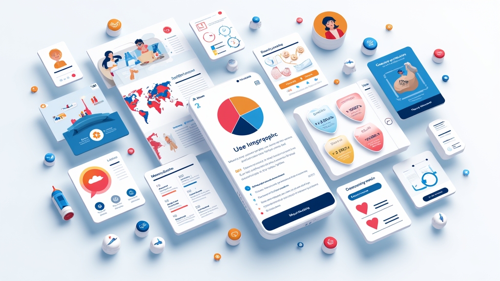
Interactive infographics are visual representations of data that allow users to engage directly with the content. Unlike traditional infographics, which simply display information, interactive versions enable viewers to click on elements or hover over sections for additional details. Key characteristics include:
- User Engagement: They encourage active participation.
- Dynamic Content: Information can change based on user interaction.
- Visual Appeal: Bright colors and appealing designs attract attention.
These features make interactive infographics powerful tools for marketers looking to convey complex information in an engaging way.
Differences Between Static and Interactive Infographics
The main difference between static and interactive infographics lies in user engagement. Static infographics present information without allowing any interaction; they are great for quick insights but lack depth. In contrast, interactive infographics provide layers of information through user actions such as clicks or scrolls. This interactivity not only makes learning fun but also helps users retain information better by involving them directly in the learning process.
Benefits of Using Interactive Infographics in Marketing
Enhanced Engagement and User Experience
One of the biggest advantages of using interactive infographics is enhanced engagement. When users interact with content—like clicking buttons or exploring different sections—they spend more time on your page. This increased dwell time signals to search engines that your content is valuable, potentially improving your rankings.
Moreover, an enjoyable user experience fosters a positive impression of your brand. Engaging visuals paired with informative content can make complex topics easier to understand while keeping audiences interested.
Improved Information Retention
Interactive elements help improve information retention rates significantly compared to static formats. Studies show that people remember 65% of visual content three days later when it includes interactivity versus just 10% when it’s purely text-based. By allowing users to explore data at their own pace through interactions, you enhance their ability to recall important details later.
Increased Shareability and Reach
Interactive infographics are inherently shareable due to their engaging nature. People love sharing unique content on social media platforms or via email because it provides value beyond simple text posts or images. As a result, this leads to greater reach for your marketing campaigns as more individuals become aware of your brand through shared experiences.
Steps to Create Effective Interactive Infographics
Defining Your Goals and Target Audience
Before diving into design, it’s essential first to define clear goals for your infographic project—what message do you want to convey? Who is your target audience? Knowing these factors will guide every decision throughout the creation process—from choosing colors that resonate with viewers’ preferences down to selecting relevant data points that speak directly about their interests.
For instance, if you’re targeting young adults interested in fitness trends, consider using vibrant colors along with statistics about exercise habits tailored specifically toward this demographic.
Choosing the Right Tools and Software
Once you’ve outlined goals and identified audiences, select appropriate tools for creating interactive infographics efficiently! There are several software options available today designed specifically for crafting visually stunning graphics without requiring extensive design skills:
- Canva: Offers templates suitable for beginners.
- Visme: Provides advanced features like animations.
- Infogram: Focuses on data visualization capabilities.
Choosing the right tool depends largely on personal preference as well as desired functionality—so take some time experimenting before settling down!
Designing Compelling Visuals and Layouts
Effective design plays a crucial role in capturing attention while ensuring clarity within an infographic layout! Start by organizing key messages logically so viewers can easily follow along during interactions:
- Use headings/subheadings strategically,
- Incorporate contrasting colors,
- Balance text-to-image ratios appropriately.
By following these guidelines closely during development stages—you’ll create compelling visuals capable enough not just informatively but also aesthetically pleasingly!
Best Practices for Interactive Infographic Design
Keeping It Simple and Focused
When designing an interactive infographic, simplicity should be at its core! Avoid cluttering visuals with excessive text or too many images; instead focus solely upon conveying one primary message clearly per section/element presented throughout graphic itself! A clean layout allows viewers quickly grasp ideas without feeling overwhelmed—which ultimately enhances overall effectiveness!
Additionally ensure each part serves specific purpose aligned towards achieving defined goals established earlier—this way everything remains relevant while maintaining viewer interest throughout entire piece created together!
Incorporating Interactivity Wisely
Interactivity should enhance—not distract from—the main message being conveyed within infographic itself! Consider adding features like clickable tabs revealing additional facts rather than overwhelming audiences all at once through excessive pop-ups everywhere across screen surface area displayed upon initially loading page up front immediately after clicking link leading here first place originally intended altogether instead focusing solely upon presenting one idea effectively beforehand before moving onto next step thereafter afterwards instead!
This approach ensures smooth transitions between segments while keeping things organized neatly structured overall making sure nothing gets lost amidst chaos surrounding various interactions occurring simultaneously around same time frame period involved here too!
Ensuring Accessibility for All Users
Accessibility matters greatly when creating any form digital media—including interactive infographs! Ensure designs adhere compliance standards set forth by organizations such as WCAG (Web Content Accessibility Guidelines). This means considering color contrasts carefully chosen fonts sizes readable even those experiencing vision impairments disabilities needing assistance navigating web pages easily without hindrance whatsoever.








![NEEWER 55W 18"/45cm Ring Light Kit [New Version], 5600K Dimmable ...](https://m.media-amazon.com/images/I/414QLqvZWLL._AC_.jpg)

