Marketing: Data Visualization for Marketing Success
Introduction
In today’s fast-paced marketing world, data visualization is more important than ever. It helps you turn complex data into clear visuals that tell a story. With the right visuals, you can make better decisions and communicate effectively with your audience. This article explores how data visualization enhances your marketing strategies, making it easier to understand trends and insights that drive success.
Understanding Data Visualization
Definition and Key Concepts
Data visualization is the graphical representation of information and data. By using visual elements like charts, graphs, and maps, it helps you see patterns or trends in your data quickly. Key concepts include clarity, accuracy, and relevance—ensuring that the visuals are easy to understand while accurately representing the underlying data.
Types of Data Visualizations Used in Marketing
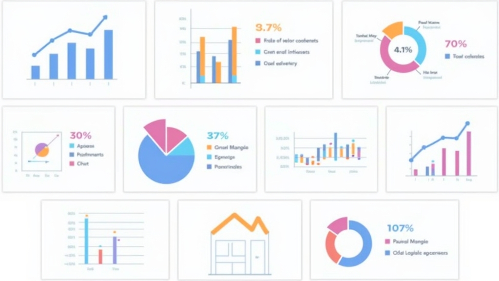
Marketers use various types of visualizations to convey their messages effectively. Common types include:
- Bar charts for comparisons
- Line graphs for trends over time
- Pie charts for showing parts of a whole
- Heat maps for displaying data density across geographical areas
Each type serves a unique purpose depending on what you want to communicate.
Benefits of Data Visualization in Marketing
Improved Insights and Analysis
One major benefit of data visualization is improved insights. When you visualize your marketing data, patterns become clearer. For instance, if you’re analyzing customer behavior over time, a line graph can show shifts in preferences or buying habits at a glance.
Enhanced Communication of Complex Information
Data visualization simplifies complex information. Instead of sifting through spreadsheets filled with numbers, stakeholders can grasp key points quickly through visuals. This makes presentations more engaging and ensures everyone understands the message without confusion.
Increased Engagement with Audiences
Visuals capture attention better than text alone. Engaging graphics can draw viewers in on social media platforms or websites. When audiences see compelling visuals related to your brand or product offerings, they are more likely to interact with your content.
Tools and Software for Data Visualization
Popular Tools for Marketers
Several tools help marketers create effective visualizations easily. Some popular options include:
- Tableau for advanced analytics
- Google Data Studio offers free reporting
- Canva provides user-friendly design templates
- Microsoft Power BI integrates well with other Microsoft products
Choosing the Right Tool for Your Needs
Selecting the right tool depends on several factors: budget constraints, technical skills required by team members, integration capabilities with existing systems, and specific features needed (like real-time updates). Assessing these criteria will help ensure you choose a tool that fits seamlessly into your workflow.
Best Practices for Effective Data Visualization in Marketing
Designing Clear and Engaging Visuals
To create effective visuals, focus on simplicity—avoid cluttered designs that confuse viewers. Use contrasting colors to highlight key points while ensuring readability remains high across devices.
Tailoring Visualizations to Your Audience
Understanding who will view your visualizations is crucial. Tailor designs based on their preferences—consider age groups or industry backgrounds—to ensure maximum impact from each graphic shared.
Maintaining Consistency Across Campaigns
Consistency builds brand recognition! Use similar color schemes or fonts across all visual materials related to campaigns so audiences instantly recognize them as part of your brand identity.
Real-World Examples of Successful Data Visualization in Marketing
Case Studies from Leading Brands
Many brands have successfully utilized data visualization techniques within their marketing efforts! For example: Coca-Cola used infographics showcasing sustainability initiatives which resonated well with eco-conscious consumers leading up to increased engagement rates!
Lessons Learned from Effective Campaigns
From these examples emerge valuable lessons such as prioritizing audience needs when designing visuals while also leveraging storytelling techniques through compelling narratives behind each dataset presented!
Challenges and Limitations of Data Visualization
Common Pitfalls to Avoid
While powerful tools exist at our disposal today there remain pitfalls worth noting including oversimplification where critical details may get lost amidst flashy graphics alongside misrepresentations stemming from poor choices made during design phases!
Understanding the Risks of Misinterpretation
Misinterpretation poses another challenge—viewers might derive incorrect conclusions if not guided properly by context surrounding each piece created! Always provide explanations alongside graphics whenever possible so audiences grasp intended messages fully!
Conclusion
As we look ahead towards future developments regarding how businesses utilize technology within their strategies one thing remains clear: embracing effective forms like those found within this realm could prove essential moving forward! Implementing strong practices around creating impactful yet informative pieces will undoubtedly lead towards greater success overall throughout any given campaign effort undertaken by marketers everywhere!
📢 Explore More: Continue Your Journey!
If this article helped you understand how vital data visualization is in marketing strategies today check out “The Role of Analytics in Modern Marketing!” It covers essential insights about leveraging analytics effectively helping you improve decision-making processes even further.








![NEEWER 55W 18"/45cm Ring Light Kit [New Version], 5600K Dimmable ...](https://m.media-amazon.com/images/I/414QLqvZWLL._AC_.jpg)


