Data Visualization for Marketing: Transforming Insights into Action
Introduction
In today’s fast-paced marketing world, data visualization is more important than ever. It helps you turn complex data into clear visuals that tell a story. By using charts, graphs, and maps, you can make sense of large amounts of information quickly. This not only aids in understanding but also supports decision-making processes. The benefits of effective data visualization include improved communication with your team and stakeholders, enhanced marketing strategies, and the ability to track performance metrics easily. Let’s explore how data visualization can transform your marketing efforts.
Understanding Data Visualization
Definition and Purpose
Data visualization is the graphical representation of information and data. By using visual elements like charts, graphs, and maps, it allows you to see trends, outliers, and patterns in data. The main purpose is to make complex data easier to understand at a glance. Instead of sifting through rows of numbers or lengthy reports, you can quickly grasp key insights that inform your marketing strategies.
Common Types of Data Visualizations
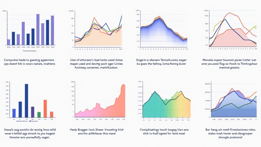
There are several common types of data visualizations used in marketing:
- Bar Charts: Great for comparing quantities across different categories.
- Line Graphs: Useful for showing trends over time.
- Pie Charts: Ideal for displaying parts of a whole.
- Heat Maps: Effective for showing density or intensity across geographical areas.
Each type serves a specific purpose and helps convey your message effectively.
The Role of Data Visualization in Marketing Strategies
Enhancing Data-Driven Decision Making
Data visualization plays a crucial role in making informed decisions based on analytics. When you visualize your marketing metrics—like website traffic or conversion rates—you can identify what works well and what doesn’t. This insight allows you to adjust campaigns promptly to improve results.
Improving Communication with Stakeholders
Visuals help bridge gaps between technical teams and non-technical stakeholders. A well-designed chart can communicate findings more effectively than lengthy explanations or raw numbers. This clarity fosters better collaboration among teams working towards common goals.
Tools and Technologies for Marketing Data Visualization
Popular Software Options
Several tools are available for creating compelling visualizations:
- Tableau: Known for its powerful analytics capabilities.
- Google Data Studio: A free tool that’s user-friendly.
- Microsoft Power BI: Offers robust integration with other Microsoft products.
These tools cater to various skill levels—from beginners to advanced users—making it easy for anyone to create stunning visuals.
Features to Look For in a Visualization Tool
When selecting a visualization tool, consider features such as:
- User-friendliness: Easy navigation is essential.
- Customization options: Personalize visuals according to branding needs.
- Integration capabilities: Ensure compatibility with existing systems.
Choosing the right tool will enhance your ability to present data effectively.
Best Practices for Creating Effective Marketing Visualizations
Choosing the Right Type of Visualization
Selecting the appropriate type of visualization is critical. Consider your audience’s needs when deciding whether a bar chart or line graph would be most effective at conveying your message clearly.
Ensuring Clarity and Readability
Always prioritize clarity over complexity in design choices. Use contrasting colors wisely so that important information stands out without overwhelming viewers. Labels should be clear; avoid jargon whenever possible so everyone understands the insights being presented.
Case Studies: Successful Use of Data Visualization in Marketing
Examples from Leading Brands
Many leading brands have successfully implemented data visualization strategies:
- Coca-Cola used dashboards that visualize customer preferences across regions which helped tailor their advertising campaigns effectively.
- Nike utilized heat maps during product launches to analyze consumer engagement by location.
These examples show how companies leverage visuals not just for reporting but as integral parts of their strategy development process.
Lessons Learned from Real-World Applications
From these case studies, we learn that effective use of visuals leads not only to better understanding but also drives action based on insights gained from the data presented clearly.
Future Trends in Data Visualization for Marketing
Emerging Technologies and Innovations
As technology evolves rapidly, new trends emerge within the realm of data visualization—such as augmented reality (AR) visualizations that allow users an immersive experience when analyzing metrics or 3D representations providing deeper insights into complex datasets.
Predictions for the Next Five Years
In five years’ time, expect even greater integration between AI technologies and visualization tools—automating processes while enhancing accuracy will become standard practice within many organizations aiming at optimizing their marketing efforts through insightful analysis derived from real-time feedback loops created by consumers online interactions today!
Conclusion
Data visualization has become an essential part of modern marketing strategies by transforming raw numbers into actionable insights! From improving decision-making processes through enhanced communication channels among stakeholders down-to-ground-level applications seen via successful brand implementations—it’s clear this approach offers numerous advantages worth exploring further! Embrace these techniques now; they could very well shape future successes within any organization looking towards growth opportunities ahead!
📢 Explore More: Continue Your Journey!
If this article helped you understand how vital data visualization is in marketing strategies, check out “The Power Behind Predictive Analytics”! It covers how predictive analytics enhances decision-making processes by leveraging historical data effectively.








![NEEWER 55W 18"/45cm Ring Light Kit [New Version], 5600K Dimmable ...](https://m.media-amazon.com/images/I/414QLqvZWLL._AC_.jpg)


